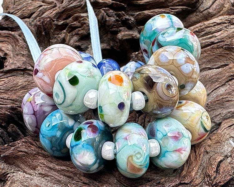
Cream Confetti Frit Lampwork Beads
In this set of beads, I experimented with the Cream Confetti Frit blend from Val Cox, and I must say, the results were delightful. Initially, I had some reservations about the frit, but all the beads turned out beautifully. This frit blend predominantly features white colors with delicate pastel accents, creating a lovely combination. One of the fascinating aspects of this frit is how it spreads, creating a transparent layer that allows the base color to shine through. To add some variation, I also incorporated a few pieces of Prism frit in some of the beads, resulting in darker spots that add visual interest.

Base Colors
- Pastel Blue Reichenbach
- Green Avocado
- Green Tea
- Chai
- Earth
- Black
- Cafe Au Lait
- Light Turquoise
- Dark Turquoise
- Violet New
When working with this frit blend, I found that the amount of frit used is an important factor, as chunkier pieces initially made me doubt the outcome. However, I was pleasantly surprised by how well the beads turned out. The base glass still shines through, and the reactions between the frit and base colors are quite enchanting. Soft colors emerge from the transparent glass in blue, green, yellow, and pink in the frit, creating a captivating interplay of hues.

In terms of bead styles, I explored both a basic mosaic approach and added twists in another set. Both techniques yielded impressive results. The mosaic-style beads showcased more pronounced reactions between the frit and the base, while using less frit allowed for more of the base color to shine through. Some base colors demonstrated reactivity, which complemented the frit beautifully. A prime example can be seen in the Green Avocado beads in the second set, where the interactions between the base color and frit are particularly striking.
Across different base glass colors, such as Pastel Blue (reminiscent of teal), Green Avocado, Green Tea, Chai, Earth, Black, Cafe Au Lait, Light Turquoise, Dark Turquoise, and Violet New, the frit blend produced delightful results. The choice of a darker or lighter base color created distinct looks, but both were equally appealing. Notably, the Violet New base color showcased an array of reactions between the base and frit, resulting in a stunning display of colors.
The first set is Pastel Blue (looks more teal than blue), Green Avocado, and GreenTea. The Green Tea glass seemed like the least reactive, but I think it is mostly because there is less contrast.

Next, I used Chai, Earth, and then Black. It does change up the look to use darker base colors over lighter pastels. It does not seem like you can go wrong either way.

In this set, I used Cafe Au Lait, Light Turquoise, Dark Turquoise, and Violet New base glass colors. As you can see there is no base color that looks bad. In Violet New, you can really see the reactive base working with the frit with all the reactions. This is something you can use to your advantage.

The single mosaic beads turned out beautifully, inspiring me to create an entire pastel set. Unfortunately, the single brown beads posted above didn't quite complement the soft, delicate hues of this lampwork bead set. I'll either have to make a new set that matches the brown beads or turn the brown ones into a lovely pair of earrings.
Base glass colors:
- Jupiter Storm
- Pink Bubblebath
- Green Avocado
- Bubblebath
- Light Sky Blue
- Painted Hills
- Lavender
- Primavera

In the following set, I experimented with applying the frit in an encased transparent swirl style. The beads exude an elegant, almost white appearance, delicately infused with hints of enchanting pastel colors. The frit itself contains tiny pieces of opaque colors that manifested in a myriad of charming ways within each bead. When creating a complete set, you'll discover some beads exhibiting more captivating blues and turquoise tones, while others boast gentle shades of pinks. The overall effect renders these beads a mesmerizing and gentle cream pastel, evoking a sense of tranquility and sophistication.

In the upcoming series of beads, I decided to get creative by incorporating a touch of Prism transparent frit colors. This experimentation yielded fascinating results, enhancing the green hues in certain beads, depending on the choice of transparent colors used. Each bead takes on a distinct personality, influenced by the specific transparent colors added. The interplay between these colors and the cream confetti blend creates a harmonious and delightful visual symphony.

Finally, I introduced a touch of Fuchsia Pink transparent color to these beads, exercising restraint in its application. Even a small amount was enough to gracefully shift the beads towards a lovely pink hue. By adding just the right measure, I ensured that traces of white and subtle variations of pink were still preserved within each bead. The delicate balance achieved in this process led to a captivating ensemble where the soft pinks dance harmoniously with the remaining elements, resulting in a truly enchanting and delightful display of colors.

In conclusion, there is no wrong way to use the Cream Confetti Frit blend. Its versatility allows for creative freedom, enabling you to experiment with various colors and techniques. Whether you prefer a mosaic-style or twist design, the frit blend adds charm and captivating reactions to your beads. Embrace the possibilities and have fun incorporating this frit blend into your lampwork creations.
